
-
Empty cart
No products in the cart.
Return to Shop
Description
Description
Overview
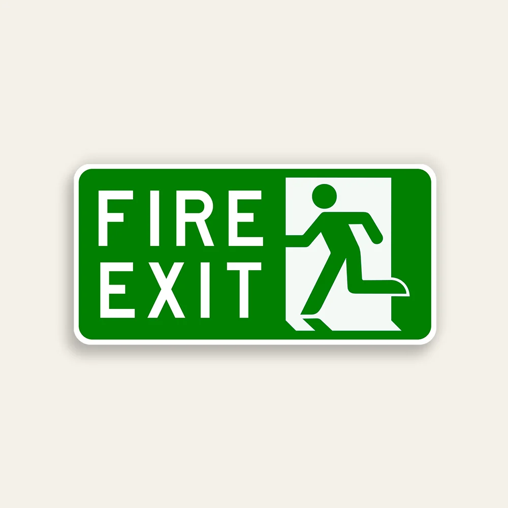
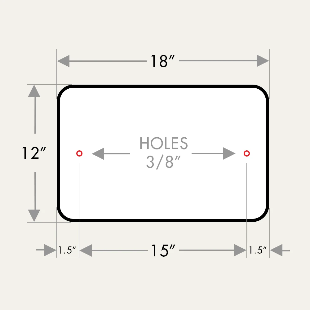
This 14″ × 7″ horizontal sign carries the same green-and-white fire exit message as the icon-left variant but reverses the internal layout — “FIRE EXIT” in bold white uppercase occupies the left half of the panel, and the ISO running figure with white door silhouette fills the right half. This is not a cosmetic variation. In wayfinding design, the position of the directional pictogram relative to the text communicates movement — a figure on the right side of a sign implies movement to the right, while a figure on the left implies movement to the left. This right-side icon placement makes this the correct sign for exit doors and corridors where occupants need to move or look to the right to reach the egress point.
For Los Angeles building managers, facility coordinators, and fire safety compliance officers specifying egress signage across multi-exit floor plans, selecting the correct directional orientation is not a preference — it is a functional requirement. A fire exit sign pointing in the wrong direction in a smoke-filled corridor can send occupants toward a dead end rather than toward safety. California Fire Code and LAFD compliance expectations for exit marking require that posted signs accurately reflect the path of egress, making the choice between left-facing and right-facing variants a decision with direct life-safety implications.
Key Features & Benefits
- Right-side icon placement communicates rightward egress direction — positioning the running figure and door silhouette on the right half of the sign follows established wayfinding convention that the pictogram’s location indicates the direction of travel.
- Text-left layout prioritizes the written label for text-first readers — placing “FIRE EXIT” on the left ensures that English-language readers encounter the label before the pictogram, which can improve comprehension speed for occupants trained on text-based signage.
- Green running figure on white door background maintains ISO 7010 pictogram integrity — the color inversion of the figure within the door silhouette is a recognized variant of the ISO emergency exit symbol, retaining full international legibility.
- Full-bleed green background confirms safe condition and egress route at a glance — green is the global standard color for emergency exits under ISO 7010 and NFPA 170, ensuring instant category recognition before text or pictogram details are processed.
- 14″ × 7″ horizontal format suits standard door frame and corridor header mounting — the compact landscape panel fits precisely above exit doors without interfering with door hardware, and along corridor ceilings where vertical space is limited.
- Permanently printed Maxmetal® requires no electrical infrastructure or maintenance — no wiring, no battery testing, no bulb replacement — a practical advantage for secondary egress points, stairwells, and exterior exit doors where powered signage is impractical.
- Reflective option ensures visibility during power outages and low-light emergencies — reflective white elements on the green panel remain readable under emergency lighting, flashlights, and natural light when building power is interrupted.
- Maxmetal® substrate handles both interior and exterior exit door conditions — UV-stable, moisture-resistant, and warp-proof for climate-controlled corridors and exposed exterior stairwell and loading dock exit applications.
Technical Specifications
- Size: 14″ × 7″
- Material: Maxmetal® (aluminum composite panel — rigid, lightweight, weather-resistant)
- Print Options:
- Standard: Digitally printed vinyl applied to Maxmetal®
- Reflective: Direct Digital print on reflective sheeting
- Mounting Options: Wall mount, door frame mount, corridor ceiling mount (hardware not included)
- Corners: Rounded
- Use: Commercial buildings, multi-tenant office floors, retail spaces, restaurants, event venues, and stairwells — Los Angeles and Southern California
Additional information
Additional information
| Weight | 0.54 lbs |
|---|---|
| Dimensions | 14 × 7 × 0.12 in |
| Material | Maxmetal® Vinyl, Maxmetal® Reflective, PVC Vinyl, Coroplast Vinyl |
| Laminate | No, Matte |
Related Products
This product has multiple variants. The options may be chosen on the product page
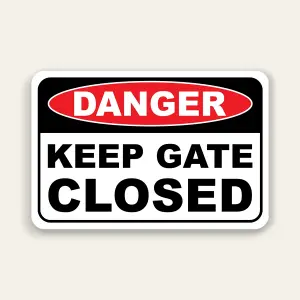
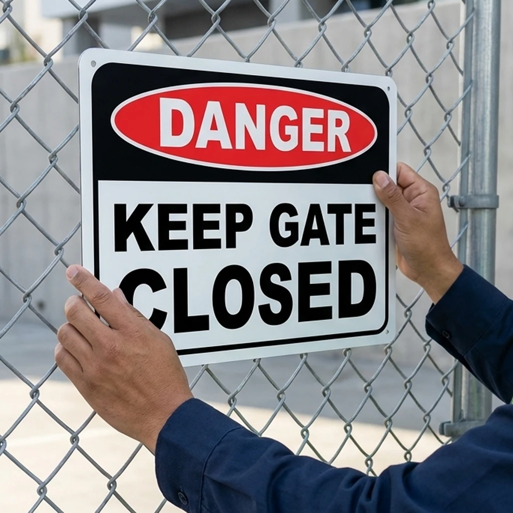
Danger Keep Gate Closed Sign
Price range: $15.00 through $33.00Alerts users to keep gates closed at all times to maintain security and safety. Ideal for residential complexes, commercial properties, and restricted access areas across Los Angeles. Helps prevent unauthorized entry and operational issues.
This product has multiple variants. The options may be chosen on the product page
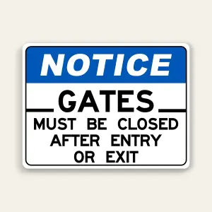
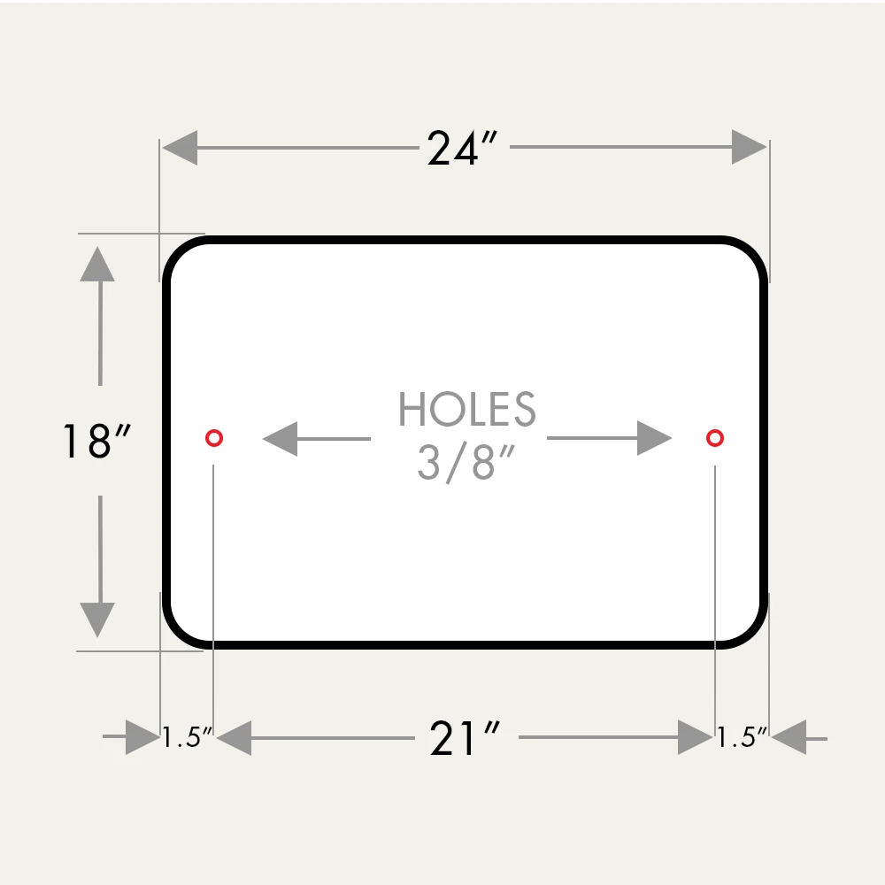
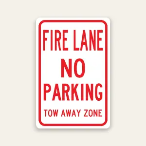
Gate Must Be Closed Notice Sign
Price range: $20.00 through $45.00Instructs drivers and residents to close gates after entry or exit. Ideal for gated communities, private properties, and secured facilities across Los Angeles. Helps maintain security and controlled access.
This product has multiple variants. The options may be chosen on the product page
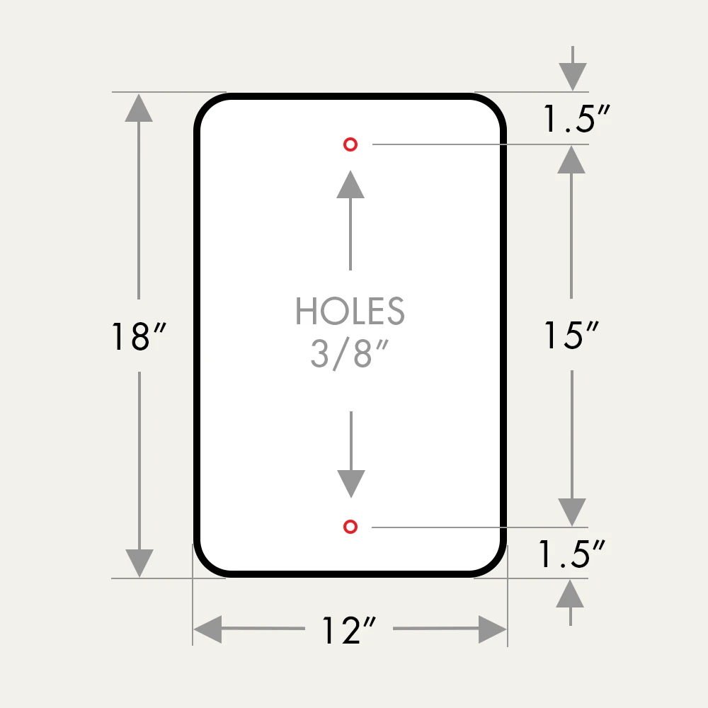
Fire Lane No Parking Tow Away Sign
Price range: $15.00 through $33.00Prevents parking in designated fire lanes and enforces immediate towing. Used in apartment complexes, commercial properties, and emergency access zones across Los Angeles. Keeps critical lanes clear for emergency vehicles.
This product has multiple variants. The options may be chosen on the product page
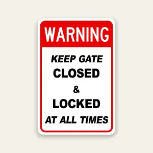
Warning Keep Gate Closed & Locked Sign
Price range: $15.00 through $33.00Ensures gates remain closed and secured at all times to maintain property safety and controlled access. Used in residential, commercial, and industrial properties across Los Angeles. Helps prevent unauthorized entry and security risks.
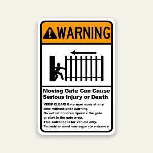
This product has multiple variants. The options may be chosen on the product page
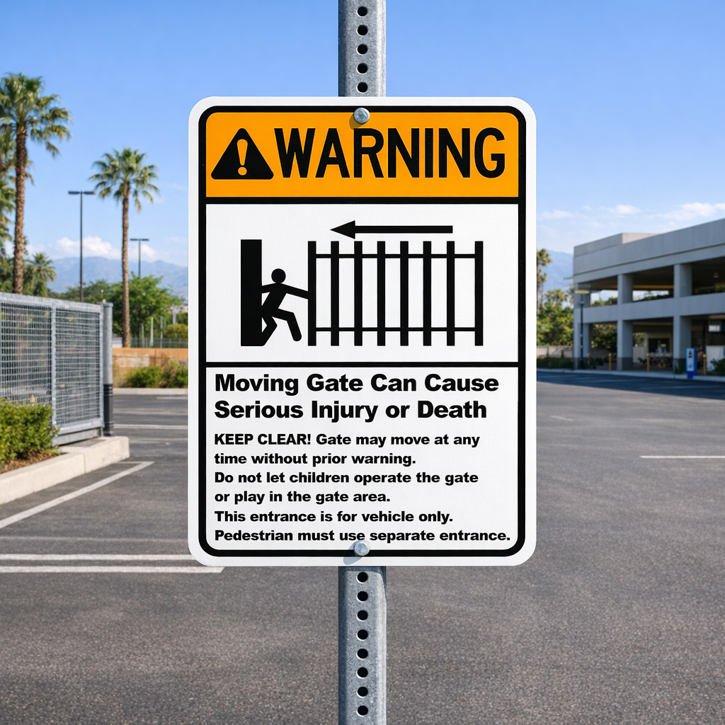
Moving Gate Safety Warning Sign
Price range: $15.00 through $33.00Warns of moving gates and potential serious injury risks. Used in gated properties, parking facilities, and commercial sites across Los Angeles. Improves safety and prevents accidents in automated gate areas.

This product has multiple variants. The options may be chosen on the product page
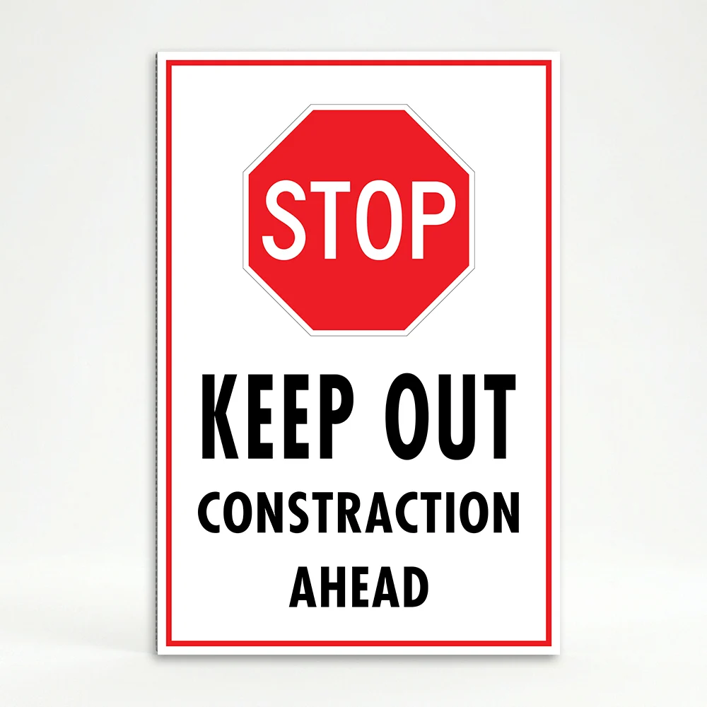
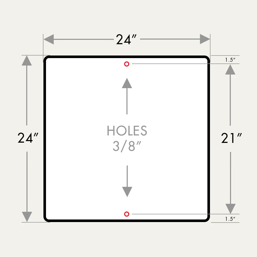
Stop Keep Out Construction Ahead Sign
Price range: $35.00 through $180.00High-visibility warning sign designed to restrict access and alert drivers or pedestrians to construction ahead.
This product has multiple variants. The options may be chosen on the product page
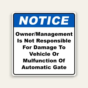
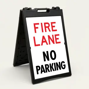
Automatic Gate Liability Notice Sign
Price range: $23.00 through $52.00Clarifies that property owners and management are not responsible for vehicle damage or gate malfunction. Ideal for gated communities, parking facilities, and private properties across Los Angeles. Helps reduce liability risks.
This product has multiple variants. The options may be chosen on the product page
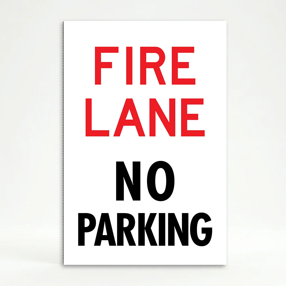
Fire Lane No Parking Sign
Price range: $35.00 through $180.00Clear and high-visibility Fire Lane No Parking sign designed to keep emergency access areas unobstructed.
This product has multiple variants. The options may be chosen on the product page
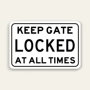
Keep Gate Locked at All Times Sign
Price range: $15.00 through $33.00Clearly instructs users to keep gates locked at all times to maintain security. Ideal for residential properties, commercial facilities, and restricted access areas across Los Angeles.
This product has multiple variants. The options may be chosen on the product page
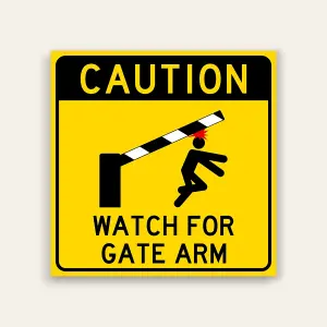
Caution Gate Arm Hazard Sign
Price range: $23.00 through $52.00Warns of moving gate arm hazards to prevent injuries. Ideal for parking facilities, gated communities, and commercial properties across Los Angeles. Enhances safety awareness in high-risk areas.
This product has multiple variants. The options may be chosen on the product page
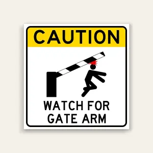
Caution Watch for Gate Arm Sign
Price range: $23.00 through $52.00Warns pedestrians and drivers to stay alert around moving gate arms. Ideal for parking entrances, gated communities, and commercial properties across Los Angeles. Helps prevent injuries and accidents.

This product has multiple variants. The options may be chosen on the product page
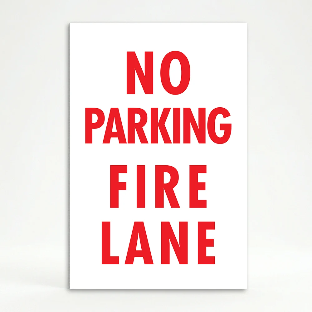
No Parking Fire Lane Red Sign
Price range: $35.00 through $180.00High-visibility No Parking Fire Lane sign designed to keep emergency access areas clear.